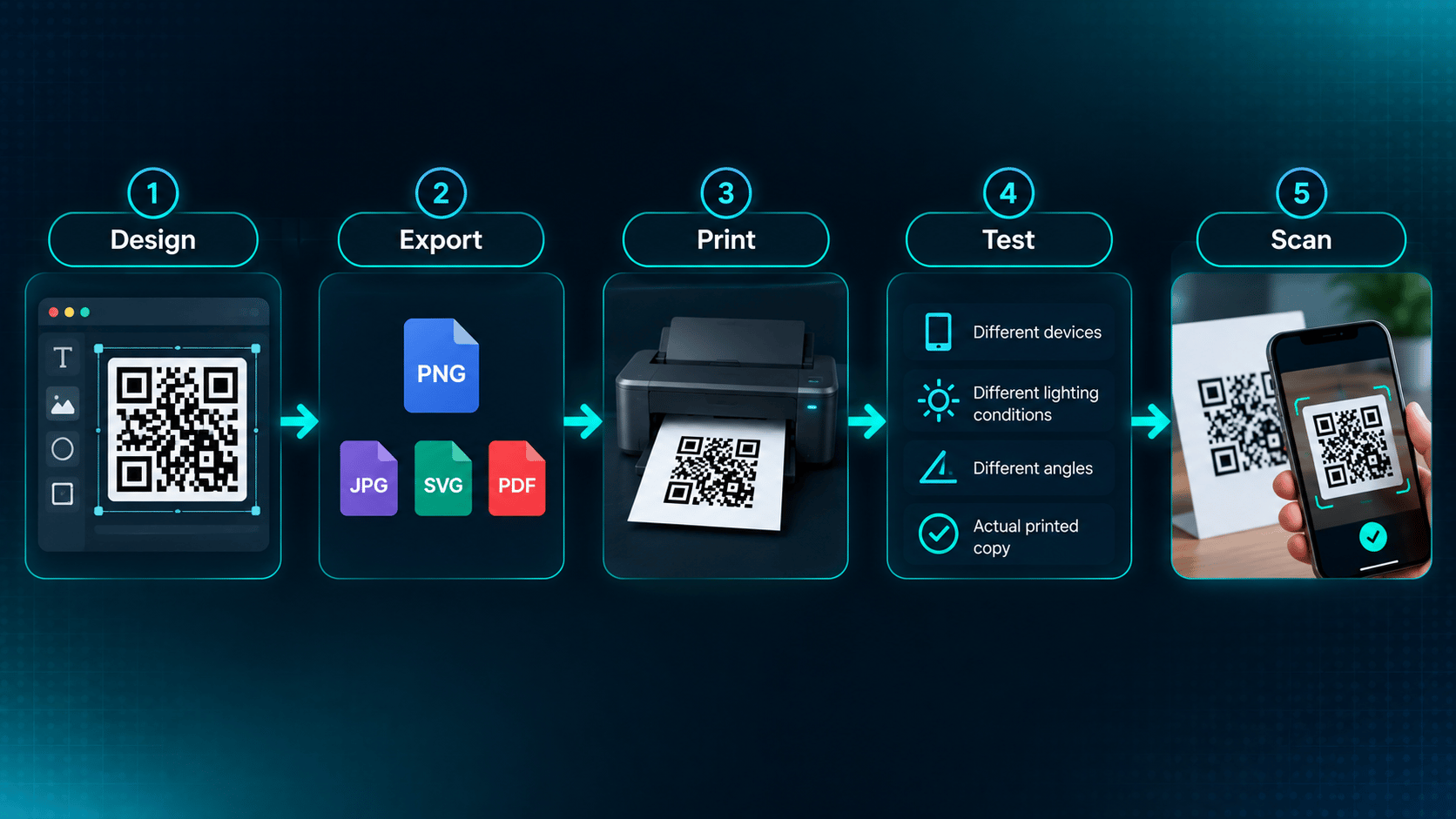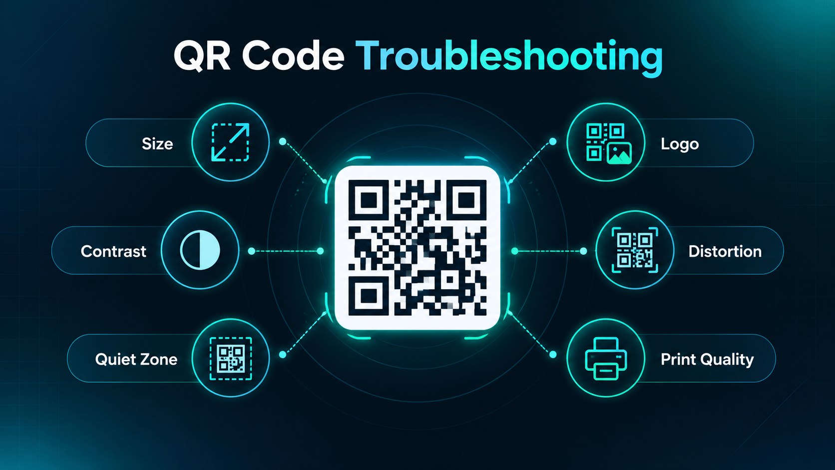
A QR code may fail to scan because it is too small, lacks sufficient contrast, has an insufficient quiet zone, contains excessive artwork or a logo, is distorted, or was printed at poor quality. The best way to diagnose the problem is to check the QR code's size, contrast, quiet zone, design, print quality, and scanning conditions.
The awkward part is that a QR code can look completely correct and still be unreadable. The pattern is there, the finder squares are in the corners, the file opens without complaint, and nothing about it looks broken. Scanners are not judging it visually, though. They are looking for a square symbol with clean module edges, a predictable margin, and enough contrast to separate dark modules from light ones, at whatever size and distance the camera happens to see it.
So the fix is rarely “regenerate the code”. It is working out which of those conditions the code failed to meet, which is what the rest of this guide walks through.
Why Isn't My QR Code Scanning?
Nearly every failure traces back to one of six things:
- Size — the modules are too small for the printer or the camera.
- Contrast — the modules do not separate cleanly from the background.
- Quiet zone — the clear margin around the symbol has been built over.
- Interference — a logo or artwork is covering structure the scanner needs.
- Distortion — the code has been stretched, skewed, or wrapped.
- Output quality — the export or the print lost the module edges.
These interact, which is why a code can survive one problem and fail the moment a second one joins it. A slightly small code with excellent contrast may read fine; the same code on a textured carton with a logo in the middle will not. The checklist below goes through them one at a time.
1. The QR Code Is Too Small
Physical size is not a single number you can look up. It comes from the QR version, which sets how many modules there are per side, and the module size, which sets how large each of those squares is in the finished artwork.
Smaller modules are harder for a printer to reproduce cleanly and harder for a camera to resolve, particularly at a distance or in poor light. DENSO WAVE's guidance is to choose module size based on the printer and the reading device, and notes that larger modules generally provide more stable reading.
There is no universal minimum that applies to every situation, so treat any fixed rule of thumb with suspicion. The reliable approach is to work the size out from your own constraints and then confirm it on the real output, which is covered in our guide to QR code size for printing.
2. There Isn't Enough Contrast
Scanners work by telling dark modules apart from the light background. When that distinction is weak, decoding becomes unreliable even though the pattern is intact.
Practical rules that hold up:
- Keep the modules dark and the background light.
- Avoid low-contrast pairings, including light modules on a mid-tone background.
- Keep gradients and busy photography out from behind the code.
- Judge the printed or exported version, not the design on a bright monitor.
This does not mean only black-and-white codes work. Some colour combinations read perfectly well; DENSO WAVE notes that readability depends on the specific colours and has to be tested. Colour is a design decision you verify, not one you assume. Our guide to QR code design covers how to make those choices without losing reliability.
3. The Quiet Zone Is Missing
The empty space around a QR code is part of the specification, not spare margin. A standard QR Code requires a four-module-wide margin on all four sides, and DENSO WAVE specifies that margin explicitly.
That clear space is how a scanner works out where the symbol starts and stops. Push a headline, a border, a product photo, or a card edge up against the code and you remove the boundary the decoder depends on.
When you plan layout space for a QR code, reserve the symbol plus its margin rather than the symbol alone. Our guide to the QR code quiet zone covers how to measure it.
4. The Logo Is Too Large
A centred logo covers modules. Error correction can restore a limited amount of that lost data, but it does not entitle you to cover an arbitrary percentage of the symbol, and the published restoration percentages are not a safe coverage budget.
What actually decides whether a logo is survivable:
- How large the logo is relative to the symbol.
- Where it sits, and whether it encroaches on the finder patterns.
- How much data is encoded, which sets the module count.
- Which error correction level the code was generated at.
Because those four factors combine differently on every code, the only reliable check is the finished output. Our guide to QR code logo size works through the trade-off in detail.
5. The QR Code Contains Too Much Data
More encoded data can push the code to a higher QR version, and each higher version adds four modules per side. That has a direct consequence for scanning.
At a fixed physical size, more modules means each individual module is smaller, and smaller modules are exactly what printers and cameras struggle with. A long tracking URL can quietly turn a comfortable code into a marginal one without anything visibly changing in the layout.
If space is tight, shorten the encoded data before shrinking the artwork. The relationship between version, module count, and printed width is covered in QR code size for printing.
6. The QR Code Is Distorted or Stretched
A QR code is square, and it has to stay square. Non-uniform resizing distorts individual modules, and DENSO WAVE documents distorted modules caused by image processing as a reading problem in its own right.
Common ways it happens:
- Stretching the image horizontally to fill a layout slot.
- Squeezing it vertically to fit a fixed height.
- Placing it on a curved surface such as a bottle or a cup.
- Resizing it with low-quality image processing that smears module edges.
Scale proportionally, lock the aspect ratio in the layout, and for curved surfaces give the code a flatter panel or a larger module size.
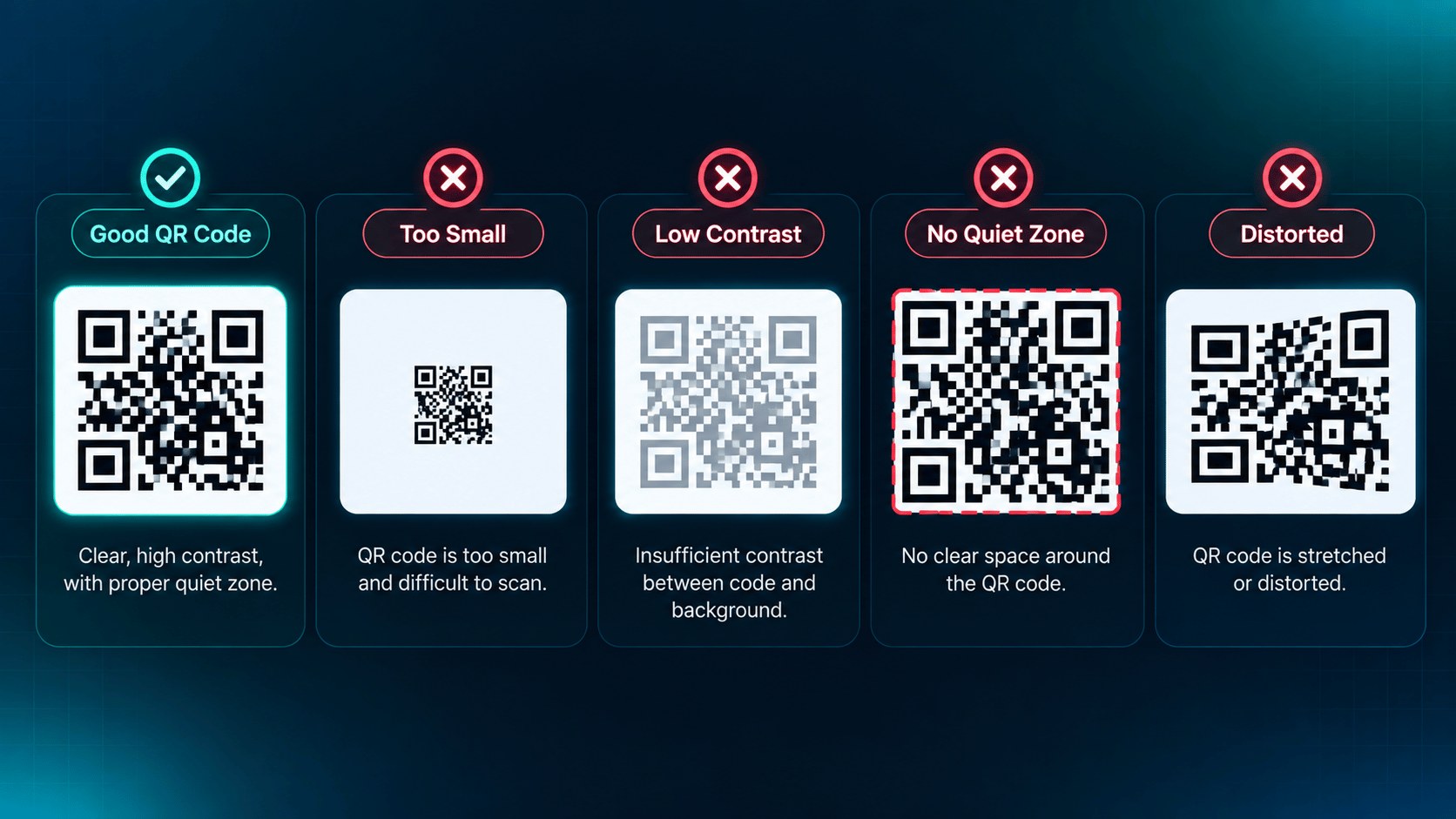
7. The QR Code Is Blurry or Low Resolution
Scanners need crisp module edges. Anything that softens those edges between design and print costs you reliability:
- Blurry raster images scaled up beyond their native resolution.
- Low-resolution exports dropped into a high-resolution layout.
- Poor printing, ink spread, or absorbent stock.
- Compression artefacts from heavily optimised files.
- Fuzzy edges where modules bleed into each other.
Export vector artwork where the printing process allows it, and use a high-quality raster export where it does not. Then check the actual printed result rather than the screen preview, because the preview will never show you ink spread.
8. Error Correction Isn't Being Used Appropriately
Error correction lets a scanner recover data from a symbol that has been partly damaged or obscured. It does not make an otherwise poorly designed QR code scannable.
The four levels trade data capacity for resilience:
- L — the lowest overhead, leaving the most room for data.
- M — a common default balance.
- Q — more resilience for tougher conditions.
- H — the most resilience, at the cost of capacity.
Raising the level also raises the amount of data the symbol carries, which can push it to a higher version and make each module smaller at a fixed size. In other words, reaching for H to rescue a large logo can make the underlying size problem worse. Our guide to QR code error correction covers what each level actually restores.
9. Artwork Is Interfering With the QR Code
This matters most for artistic AI QR codes, where the artwork and the symbol occupy the same space by design. DENSO WAVE notes that graphics overlaid on or surrounding a code can create reading problems when they interfere with contrast or the required margin.
Artistic treatment works when it preserves five things:
- Recognisable QR structure, especially the finder and alignment patterns.
- Adequate contrast between modules and background.
- The four-module quiet zone.
- Module integrity, so individual squares stay distinct.
- Sufficient size for the scanning distance.
None of that makes artistic codes inherently unreliable. Artistic QR codes require additional testing because visual styling can interfere with the structural elements scanners use to decode the code. Budget a test pass rather than a redesign.
10. The Printed QR Code Wasn't Tested
The screen version can scan while the printed version fails. Monitors are backlit, perfect in resolution, and free of ink spread, texture, and glare. Paper is none of those things.
Always test the final version:
- Scan the actual printed copy, not the screen preview.
- Try several different phones and cameras where that is practical.
- Scan from the distance people will really stand at.
- Test under the lighting of the real environment, including glare.
- Test the angles people will realistically scan from.
- Test on the final material or surface, not a plain proof sheet.
Repeat the test after any change that alters the code's size, surroundings, or material. A layout tweak late in production is exactly how a tested code becomes an untested one.
How to Fix a QR Code That Won't Scan
Work through the fixes in order. Each step removes a likely cause before you spend time on a less likely one.