QR codes don't have to look like plain black-and-white squares.
Today, QR codes can become part of a brand's visual identity, packaging, advertising campaign, event experience, restaurant menu, or promotional material. With the right design approach, a QR code can look creative and distinctive while still doing its most important job: scanning reliably.
The challenge is finding the right balance between visual creativity and QR code functionality. A good QR code design should attract attention without making the code difficult for a phone camera to recognise.
In this guide we'll look at the most important elements of QR code design, including colour, contrast, logos, shapes, size, quiet zones, error correction, and artistic QR codes.
What Makes a Good QR Code Design?
A good QR code design has two jobs:
- Get noticed
- Get scanned
Traditional QR codes usually prioritise the second goal. They use a simple black-and-white pattern because the strong contrast makes detection easy.
Creative QR codes add another layer: visual design. A well-designed QR code can incorporate:
- Brand colours
- Logos
- Illustrations
- Shapes
- Textures
- Product imagery
- Artistic styles
- Campaign themes
- Photography-inspired designs
The important part is that the visual treatment should not destroy the underlying QR structure. Think of the QR code as both a functional element and a design element.
Can QR Codes Be Creative and Still Scannable?
Yes, but creativity needs boundaries.
A QR code still contains structured information that a scanner needs to recognise. If the visual design interferes too heavily with that structure, scanning reliability can decrease. This is especially important when creating artistic QR codes using AI.
An artistic QR code may look very different from a traditional QR code, but it still needs enough visual information for a scanner to identify the encoded pattern. That's why good artistic QR code design isn't simply about making a QR code look interesting. It's about finding the balance between art, contrast, structure, and readability.
Important QR Code Design Elements
1. Colour
Colour is one of the easiest ways to make a QR code fit a brand. Instead of using only black and white, designers can use a brand's existing colour palette.
For example, a restaurant might use warm colours that match its packaging, while a luxury brand might use a more restrained palette. However, colour should always preserve sufficient contrast between the QR pattern and its background. Avoid combinations where the foreground and background are too similar.
- Dark pattern on a light background: generally easier to recognise
- Light pattern on a dark background: can work depending on the implementation
- Low-contrast colours: higher scanning risk
The goal isn't simply to make a QR code colourful. The goal is to make it colourful without sacrificing recognition.
2. Contrast
Contrast is one of the most important considerations in QR code design. A scanner needs to distinguish the QR pattern from its surrounding background, and a beautiful design with poor contrast can become a frustrating user experience.
When designing a creative QR code, consider:
- Foreground and background contrast
- Lighting conditions
- Printed material
- Screen brightness
- Viewing distance
- Background complexity
This becomes even more important when a QR code is placed on a photograph, illustration, package, or textured surface.
3. Logo Placement
Adding a logo can make a QR code feel much more connected to a brand. A logo is commonly placed in or around the centre of a QR code. However, the logo should not cover too much of the functional QR pattern, and the exact amount of space available depends on the QR implementation and error correction level.
Instead of simply placing a large logo over the code, designers should test the final QR code at the size and in the environment where it will actually be used. For example, a QR code printed on packaging should be tested on the actual packaging rather than only on a large desktop screen.
4. QR Code Shape
Traditional QR codes use square modules arranged in a grid. Creative QR code systems can introduce more visual variation into those elements, and the surrounding visual design can also influence the overall appearance of the QR code.
However, changing the appearance of QR elements too aggressively can affect recognition. The best artistic designs make the QR code feel like part of the artwork while retaining enough underlying structure for scanning.
5. Quiet Zone
The quiet zone is the empty space surrounding a QR code. It may not look important from a design perspective, but it helps scanners distinguish the QR code from the surrounding content.
When placing a QR code on posters, packaging, menus, business cards, flyers, websites, or product labels, make sure the surrounding design does not crowd it. A QR code needs room to breathe.
This is particularly important for artistic QR codes, because the surrounding artwork can otherwise make the code harder to detect.
6. Error Correction
QR codes use error correction to help recover information when part of the code is damaged or obscured. Higher error correction can be useful when a QR code needs to tolerate more visual interference, such as a logo or certain design treatments.
However, higher error correction isn't a magic solution for every design problem. A QR code that is heavily distorted, extremely low contrast, too small, or surrounded by visual noise can still fail to scan. Design and error correction need to work together.
7. Size
The physical size of a QR code matters. A QR code that looks perfect on a large monitor may become difficult to scan when printed very small.
Before publishing a QR code, consider:
- Where it will be placed
- How far away users will scan it
- Whether it will be printed or displayed digitally
- The amount of information encoded
- The complexity of the QR pattern
- The quality of the printing
Always test the final version in its intended environment.
Traditional vs Custom vs Artistic QR Codes
Not every QR code needs to be artistic. A simple black-and-white QR code can be the best option for situations where maximum simplicity is the priority, and the free QR code generator is enough for that.
A custom QR code adds design elements such as colours, logos, shapes, and branding.
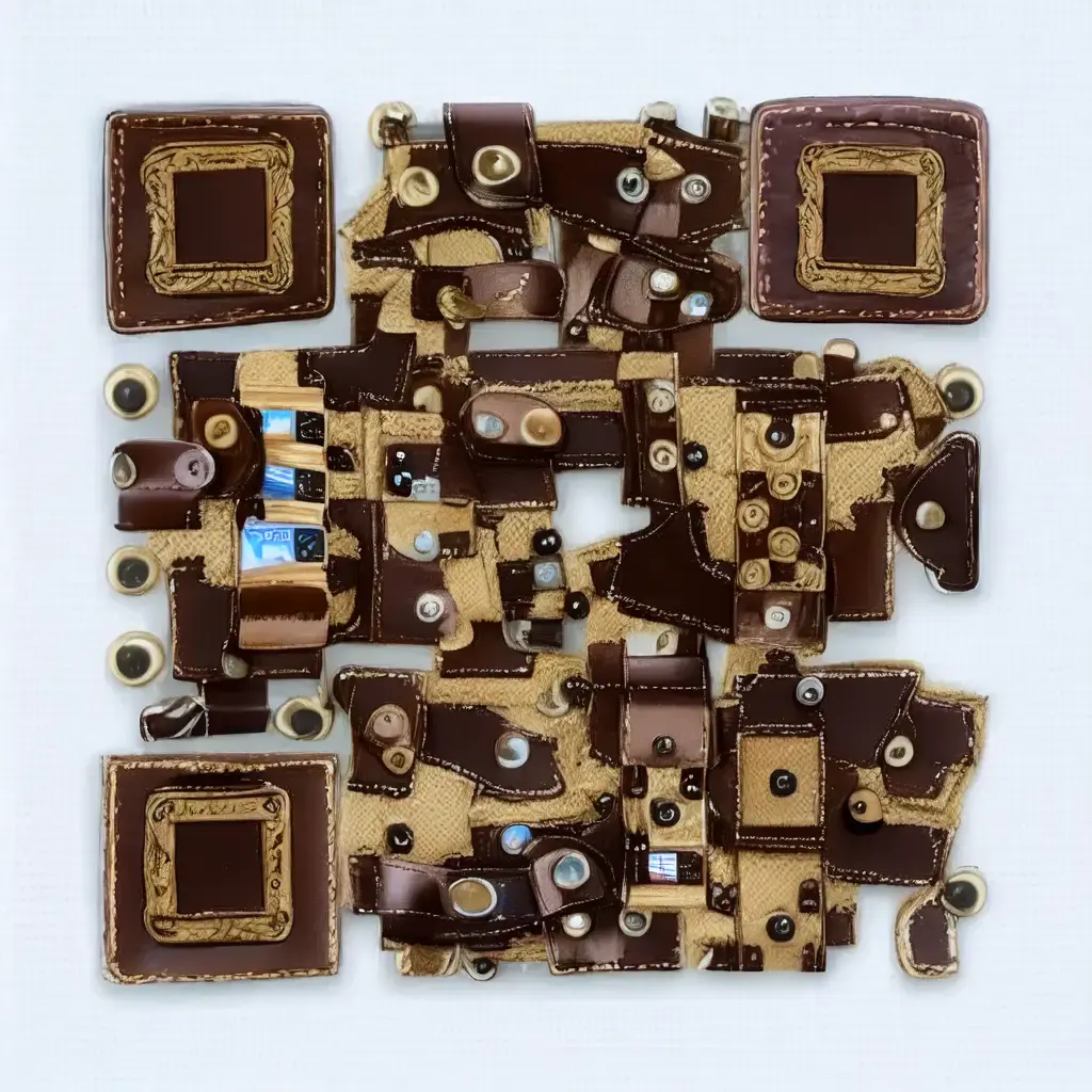
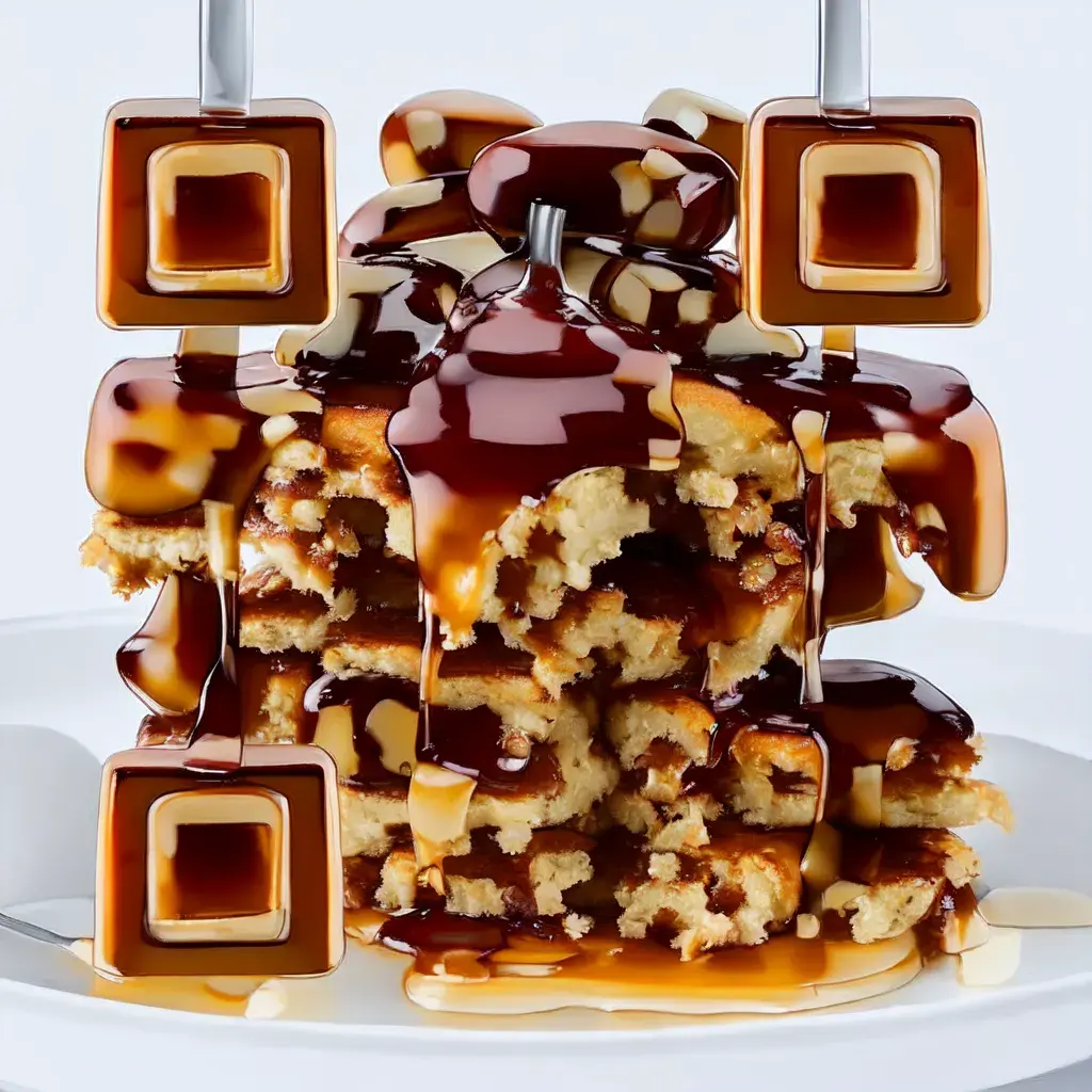
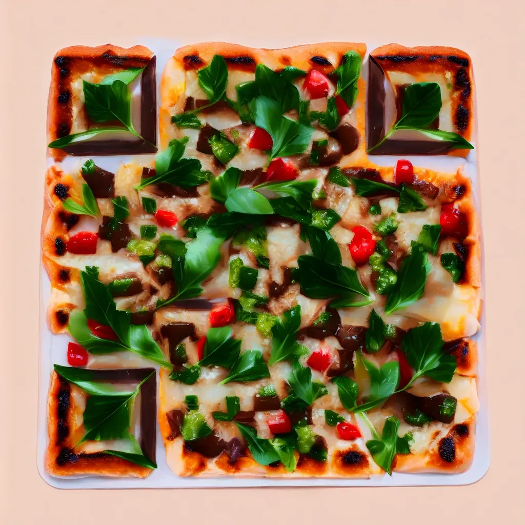
An artistic QR code goes further by integrating the QR code into a visual concept. For example, an artistic QR code can be designed around a particular subject or campaign theme. Imagine a restaurant campaign where the QR code visually incorporates food, a fashion campaign where the QR code becomes part of a leather-inspired composition, or an event campaign where the QR code is integrated into the event's visual identity.
That's where artistic QR codes become particularly interesting for marketers and designers.
Examples of Artistic QR Code Design
Here are examples of how an artistic QR code can become part of a visual concept instead of appearing as a separate black-and-white element.