QR Code Logo Size: How Big Can a Logo Be Without Breaking Scannability?
There is no universal maximum logo size. What actually decides it is placement, error correction, data density, contrast, and testing the final output.
NG QRCode••9 min read
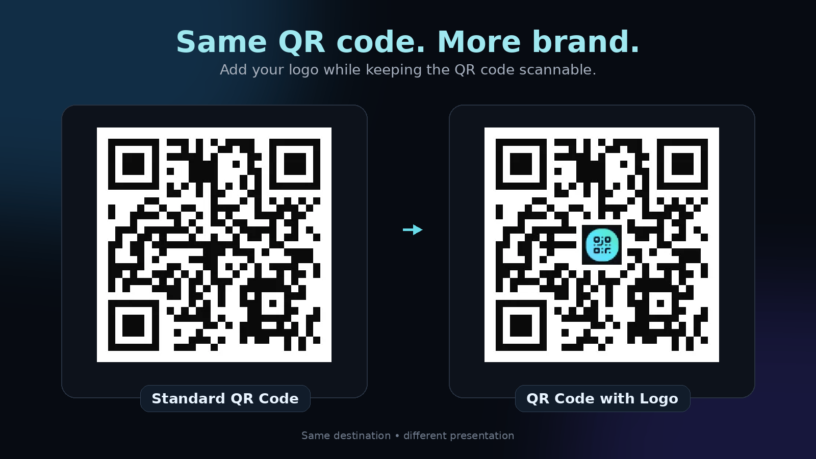
Adding a logo to a QR code is one of the simplest ways to make it feel more branded and recognisable.
But there is an important trade-off: the more of the QR code you cover with a logo, the more you can affect its ability to be scanned.
So how big should a QR code logo actually be?
There isn't one universal percentage that works for every QR code. The safe size depends on factors such as the QR code's error correction level, data density, contrast, print or screen size, and the quality of the final image.
The best approach is to keep the logo reasonably small, preserve the important QR code structures, and test the final design on real devices before using it in a campaign.
What Is the Ideal QR Code Logo Size?
There is no single official “maximum logo size” defined by the QR Code standard.
QR Codes have built-in error correction that allows some damaged or obscured data to be recovered. There are four error correction levels: L, M, Q, and H, with approximate restoration capabilities of 7%, 15%, 25%, and 30% of codewords respectively.
However, error correction percentage should not be interpreted as “you can cover that percentage of the QR code with a logo.”
That's an important distinction.
A QR code contains different functional areas, and not every part of the symbol can be treated equally. Covering an important detection pattern can cause problems even when the total covered area appears small.
For a practical branded QR code:
Keep the logo relatively small.
Place it near the centre.
Don't cover the three large finder patterns in the corners.
Maintain strong contrast between the QR code and its background.
Use appropriate error correction.
Test the finished QR code before publishing.
For important marketing campaigns, scannability should always win over logo size. The same principle runs through our wider guide to QR code design.
Why Can a Logo Be Placed Inside a QR Code?
QR Codes are designed with error correction.
When a QR code is partially damaged or obscured, the encoded information may still be recoverable. DENSO WAVE explains that QR Codes use Reed-Solomon error correction and provide four error correction levels.
This is what makes some QR code customisation possible.
A logo can occupy part of the central data area while the remaining QR structure still provides enough information for a scanner to decode the code.
But error correction isn't a free pass to cover large portions of the QR code. The result depends on the complete design.
A QR code with a small, high-contrast logo may scan perfectly, while a heavily decorated QR code with the same theoretical error correction level may fail.
Does QR Code Error Correction Determine Logo Size?
Partly, but not by itself.
QR Codes support four error correction levels:
L
approx. 7% restoration
M
approx. 15% restoration
Q
approx. 25% restoration
H
approx. 30% restoration
These percentages refer to codewords that can potentially be restored, not the percentage of the visible QR image that you can safely cover with a logo.
Increasing error correction generally makes the QR code more resistant to damage, but it also increases the amount of data in the symbol and can result in a larger or denser QR code.
That's why choosing the highest error correction level isn't automatically the best solution. The right setting depends on the application and the amount of data being encoded, as covered in our guide to QR code error correction levels.
Where Should a Logo Go on a QR Code?
The safest general placement for a logo is near the centre of the QR code.
The three large square patterns in the corners are important for locating and orienting the QR code. DENSO WAVE explains that these position detection patterns enable stable, high-speed reading.
Avoid placing your logo over these areas.
A good logo placement should:
Stay away from the three corner finder patterns.
Avoid unnecessarily covering alignment or timing structures.
Remain centred and visually balanced.
Have enough contrast to remain clearly separated from the QR pattern.
Include a clean background or padding when necessary.
The goal isn't simply to make the logo fit. The goal is to make the QR code look branded while preserving the visual information a scanner needs.
Logo Width vs. Logo Area
One reason QR code logo advice can be confusing is that people often talk about logo size as a percentage of the QR code's width.
But width and covered area are not the same thing.
For example, increasing the width of a square logo from 20% to 30% doesn't increase its covered area by only 10 percentage points. Because the logo is two-dimensional, the covered area changes much faster.
That's why a logo that looks only slightly larger can remove significantly more of the QR code's data modules.
Instead of designing around a theoretical maximum, use a conservative logo size and validate the finished QR code.
Does the Amount of Data Affect Logo Size?
Yes.
QR Codes have different versions, from Version 1 through Version 40. Each version contains a different number of modules, starting at 21 × 21 modules and increasing by four modules per side with each version.
More data can require a higher QR code version and therefore a denser pattern. A dense QR code contains more small modules packed into the same physical area, which can make visual customisation more demanding.
For example, two QR codes may have logos that are visually identical in pixel size, but one may be much denser because it contains more encoded data.
This is another reason why there isn't one universal logo-size rule that works for every QR code.
Don't Forget the Quiet Zone
The logo isn't the only part of a QR code design that matters.
There should also be a clear area surrounding the QR code, known as the quiet zone.
DENSO WAVE specifies a margin of four modules around a standard QR Code. This clear space helps scanners distinguish the QR code from surrounding content.
Avoid placing text, graphics, borders, or other design elements directly against the QR code.
A beautiful logo inside the QR code won't help if the surrounding design makes the code difficult to detect.
Contrast Matters Too
A branded QR code doesn't have to be black and white.
However, the QR pattern still needs sufficient visual distinction from its background.
DENSO WAVE warns that decorations, overlaid images, distortion, and insufficient contrast can make QR Codes difficult or impossible to read.
For branded QR codes, prioritise:
Strong foreground and background contrast
A simple background behind the QR code
Clear module shapes
No unnecessary visual noise
A recognisable logo
A clean quiet zone
You can make a QR code colourful and artistic without making every part of it visually complicated.
How to Test a QR Code With a Logo
Never judge scannability only by looking at the image on your monitor. Test the actual final QR code.
A good testing process is:
01
Test with multiple phones
Try the QR code with several modern smartphones rather than relying on one device.
02
Test from different distances
Scan from the distance people are realistically expected to use.
03
Test the final size
A QR code that works beautifully as a large image on your computer may behave differently when printed on a small package or poster. DENSO WAVE notes that readable module size depends on both the printing system and the scanning device, and that larger modules generally provide more stable reading.
04
Test the actual environment
If the QR code will be printed on packaging, test the printed packaging. If it will appear on a poster, test the poster. If it will appear on a screen, test it from the expected viewing distance.
05
Test after exporting
Don't only test your original design file. Test the final PNG, SVG, PDF, or printed version that users will actually see.
Common QR Code Logo Mistakes
Making the logo too large
A large logo may look impressive but can remove too much useful QR information.
Covering a finder pattern
The three large corner patterns are important for detection and orientation. Don't treat them like ordinary data modules.
Using a low-contrast logo
A logo that blends into the QR pattern can reduce visual clarity.
Removing the quiet zone
Surrounding the QR code with text, graphics, or other elements can make detection more difficult.
Testing only the original image
Always test the final version at its real-world size.
Assuming error correction solves everything
Higher error correction improves the QR code's ability to recover from some damage, but it doesn't guarantee that an aggressively redesigned QR code will scan.
What Makes a Good Branded QR Code?
A good branded QR code balances three things: branding, design, and scannability.
The QR code should be recognisable enough to fit naturally into your visual identity, but the design should never make scanning unnecessarily difficult.
That means you can experiment with:
Colours
Shapes
Logos
Rounded modules
Artistic styles
Brand backgrounds
Creative compositions
But the underlying QR structure still needs to remain usable.
This is especially important when creating artistic QR codes with AI. The design can become much more visually complex than a traditional QR code, so testing becomes even more important.
QR Code Logo Size: The Practical Rule
If you want one simple rule to remember:
Make the logo as small as you can while still making it recognisable, then test the final QR code in its real-world environment.
Don't design around a theoretical maximum.
A QR code used on a product package, business card, restaurant menu, event poster, or digital advertisement may have completely different scanning conditions.
The best logo size is therefore the size that gives you the branding you need without compromising reliable scanning.
Frequently Asked Questions
›How big should a logo be on a QR code?
There is no universal maximum logo size. Keep the logo conservative, avoid important QR structures, use appropriate error correction, and test the final QR code before publishing.
›Can a QR code have a logo in the middle?
Yes. Logos are commonly placed near the centre of a QR code, where they can occupy part of the data area while leaving the important corner finder patterns unobstructed.
›Does a bigger logo make a QR code harder to scan?
It can. A larger logo can obscure more of the QR code's encoded information, increasing the risk of scanning problems.
›Does QR code error correction make logos safer?
Error correction can help a QR code recover from some damaged or obscured data, but the error correction percentage should not be treated as the percentage of the QR image that can safely be covered by a logo.
›Should a QR code logo have a white background?
A clean background or padding around the logo can help maintain visual separation between the logo and QR modules. The exact treatment depends on the design, but contrast should remain strong.
›How do I know if my QR code with a logo works?
Scan the final QR code using multiple phones and test it at its intended physical or display size. For printed applications, test the actual printed version.
Create a Branded QR Code
Want to create a QR code that looks more like part of your brand than a generic black-and-white square? NG QRCode lets you create artistic and branded QR codes designed around your visual concept, so you can experiment with colours, creative styles, logos, and artistic designs while keeping the QR code's purpose intact.